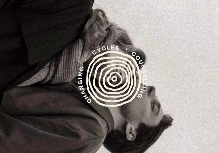
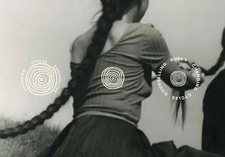
Changing Cycles Counselling
A brand identity concept and website homepage concept currently in progress.
Concept for: Rubi Vasquez
Industry: Psychotherapy
Scope: Brand and Web Design
Vibe: Warm. Cultural. A little poetic.
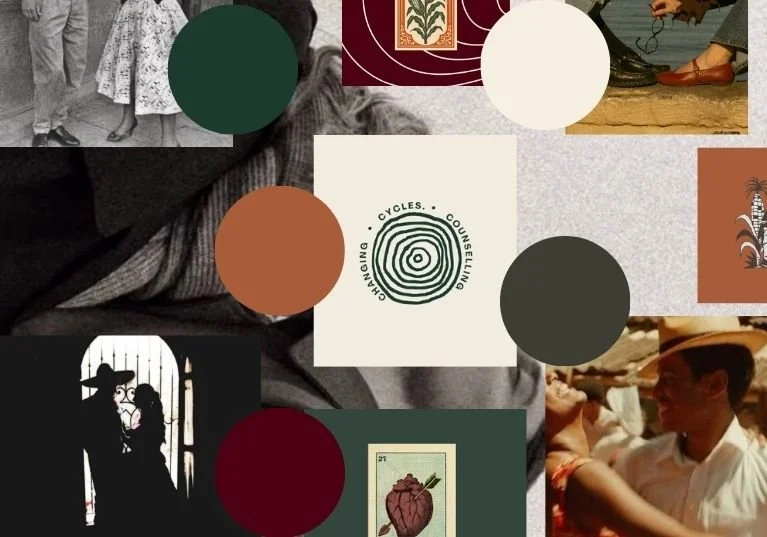
Rubí is a bilingual couples therapist in California, working with people navigating betrayal, disconnection, and the kind of relationship rupture that doesn't resolve on its own. Her current site had the right instincts - a strong colour palette, a cultural warmth, but the pieces weren't pulling together into something cohesive.
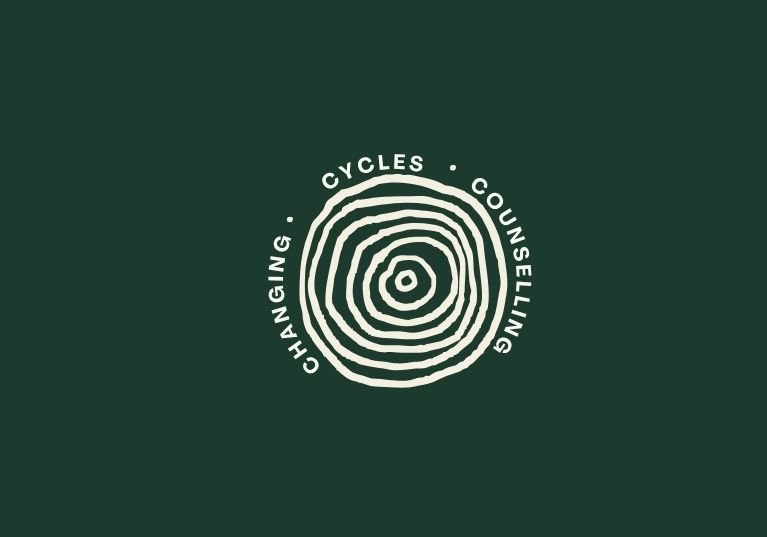
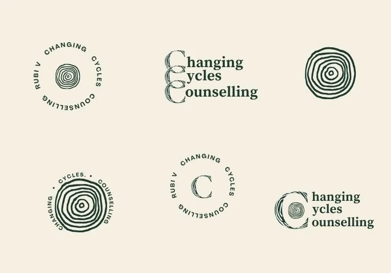
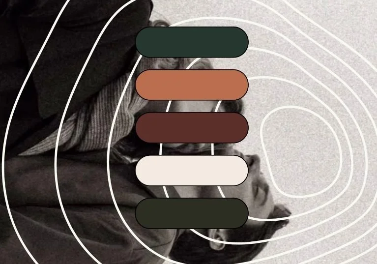
The rebrand builds on what was already there. We kept the deep forest green and cream but extended the palette into something with more range and depth. The new logo mark uses a concentric ring motif - a nod to cycles, to the caracol, to the idea that change moves in layers rather than straight lines. The overall direction is warm and editorial, with a vintage Latin quality that feels specific to her rather than borrowed from generic wellness aesthetics.
The website is currently in progress..